
Redesigning Pill Club’s Prescription Flow to Reduce Friction and Confusion
Signing up for birth control online meant navigating a long, confusing questionnaire on mobile—creating friction for patients and extra work for clinicians. I mapped the decision logic, simplified medical language, and redesigned the flow and UI so the experience felt clearer, faster, and more supportive. The new prescription flow improved mobile usability, helped patients make more confident choices, and made reviews more efficient for Pill Club’s medical team.
TeamProduct Designer (me)
Copywriter
RoleProduct Designer
ResponsibilitiesUX Research
Visual Design
Product Design
processDouble Diamond Framework:
Discover, Define, Develop, and Deliver
CompanyPill Club is a birth control subscription service that prescribes birth control online and delivers refills with bonus goodies to patients.
Mission
Make getting on birth control simple, affordable, and delightful.
Users
Primarily women in their 20s–30s in most U.S. states

BackgroundNavigating a Complex Health Questionnaire
During sign-up, users complete a detailed health questionnaire that determines their eligibility for birth control options. The questionnaire surfaces potential health risks for the medical team, enabling licensed nurse practitioners to prescribe a method that fits each user’s preferences and needs.

ChallengeUnclear Logic, Poor Documentation, and Compliance Pressures
While the questionnaire served a critical regulatory and medical purpose, it lacked internal clarity. There was no complete diagram of the flow, no centralized documentation, and no established process for making updates. As a result, stakeholders across teams struggled to understand how the system worked—and users faced confusing, disjointed experiences during sign-up.
Outdated detailed flow diagram of the sign-up experience

Understanding the Prescription Questionnaire
I began by investigating how the prescription questionnaire worked end-to-end. This involved tracing the full user experience, identifying decision points, and surfacing gaps that could impact user understanding or medical review.
Discoverflow diagramVisualizing Content, Logic, and Interaction
I created a detailed flow diagram to make the questionnaire’s structure easier to understand. I used familiar traffic light colors and road sign-inspired icons to illustrate logic paths, eligibility checkpoints, and major interaction points—giving stakeholders a clear, intuitive view of the flow for the first time.
Symbols
Colors
Define the problemIdentifying Friction Points Across Flow, Content, and Interface

Flow issues
Irrelevant or unnecessary questions
Illogical sequencing that confused users
Two separate questionnaires that failed to integrate smoothly

Content issues
Typos and confusing phrasing
Incorrect content displayed in some paths
Unexplained medical jargon that overwhelmed users

UI issues
Poor mobile optimization
Weak visual hierarchy
Limited accessibility for diverse users
Problem StatementsUser
How might we reduce friction in the prescription questionnaire to make sign-up faster, clearer, and less overwhelming?
Medical Team
How might we streamline the questionnaire to help providers efficiently gather the information they need to prescribe the right birth control?
UsersDesigning for Both New and Experienced Birth Control Users
The questionnaire needed to support two distinct user mindsets:
Need TLCers (1/3)
New to the pill or experiencing complications
Struggle is Realers (2/3)
Already familiar with the pill and seeking convenience
ConstraintsBalancing Legal, Medical, and User Experience Needs
Several constraints shaped the redesign:
Certain questions were legally required and could not be removed.
Medical terminology had to be used accurately, even if it added complexity.
Some medical jargon needed to remain to ensure clinical precision and regulatory compliance.
Designing a Smarter, Simpler Questionnaire Experience
After mapping the flow and identifying key friction points, I developed six strategies to reduce sign-up barriers, simplify medical review, and enhance the user experience.
Develop the SolutionIdea 1Rearrange the Questions in a More Logical Order
In the original questionnaire, users often answered multiple questions before learning they were ineligible. I redesigned the flow to save users time and reduce frustration.
Moved disqualifying questions to the beginning
Sequenced limiting questions immediately after
Grouped related questions for smoother progression

Idea 2Let Users Know Which Option They’re Eligible for at the End
In the original questionnaire, users were sometimes asked about birth control methods they weren’t eligible for, causing confusion and frustration. I redesigned the flow to delay eligibility information until the end, keeping the experience focused and relevant.
Let users complete the questionnaire before surfacing eligibility outcomes
Removed unnecessary questions about the POP pill when it was the only available option
Removed unnecessary questions about the ring when users were ineligible
Idea 3Combine Two Questionnaires for Different Birth Control Methods
I combined both paths into a single, streamlined questionnaire to simplify the experience and reduce redundancy.
Merged overlapping questions from the pill and ring questionnaires
Added specific questions to properly support ring prescriptions within the unified flow
Idea 4Make the Content Easy to Understand to Prevent Confusion
The original questionnaire included confusing medical jargon and inconsistent language, which overwhelmed some users and delayed completion. I simplified and clarified the content while maintaining medical accuracy to create a smoother, more supportive experience.
Removed confusing medical jargon and unnecessary complexity
Added educational context to help users make informed choices
Standardized and tightened copy for clarity and consistency
Idea 5Edit the Questions to Make Them Less Overwhelming
The original questionnaire presented users with too much information at once, making the process feel overwhelming. I restructured the questions to reduce cognitive load and help users move through the flow more confidently.
Merged related questions to simplify the experience
Added logic to introduce questions gradually instead of displaying all content at once
Displayed follow-up questions dynamically based on user selection to avoid overwhelming users
Idea 6Have Users Provide More Information on Their Medical History, Concerns, and Questions Upfront
In the original questionnaire, the medical team often had to follow up with users for additional information before they could prescribe birth control, slowing down the process. I added opportunities for users to proactively share more details during sign-up to streamline medical review.
Asked users to list any current medications they are taking
Allowed users to provide any concerns or additional information they wanted the medical team to know
Flow DiagramRedesigning the Questionnaire Based on User Testing and UX Best Practices
The updated prescription questionnaire flow was based on the six core design strategies.
Let users know which option they’re eligible for in the end
Rearranged the questions in a more logical order
Combined the pill & ring questionnaire
Made the content easy to understand to prevent confusion
Edited the questions to make them less overwhelming
Had users provide more medical history info, concerns, and questions upfront
Removing Sign-Up Friction by Improving the User Interface
To support a smoother and more mobile-friendly experience, I redesigned the questionnaire interface across layout, visual hierarchy, and interaction patterns.
Develop the designOptimize for Mobile and Touch
Since 98% of users accessed the site on mobile devices, making the questionnaire touch-friendly was critical.
Moved primary content and actions toward the center of the screen to support easier thumb reach
Visually defined clickable areas and touch targets to increase selection accuracy and confidence
Increased button size to meet best practices, ensuring a minimum touch target of 1cm × 1cm for easier tapping

before
afterCreating a Stronger Visual Hierarchy with Contrast, Color, and Typography
I visually established a clear order of importance to guide users where to look first and help them navigate the questionnaire more easily.
Displayed questions in a heading style with larger font sizes
Applied color and contrast to reinforce visual hierarchy
Used off-white backgrounds with black text to reduce eye strain

before
afterEnhancing the Experience with Illustrations and Icons
I used illustrations and icons to make the questionnaire feel more engaging, branded, and supportive for users.
Added friendly illustrations to enrich the brand experience
Introduced icons as quick visual aids to support faster decision-making
Increased visual interest to reduce fatigue during the questionnaire flow


Create a clearer visual indication of selected answers
To support accessibility and help users confidently select their answers, I redesigned the selected states to be more prominent and clear.
Disabled unselected options after a choice was made
Highlighted the selected button background, border, and radio button with a solid accent color

before
afterValidating Design Improvements Through Prototype Testing
I refined the final questionnaire based on findings from prototype user testing focused on content clarity and decision-making support.
Users responded positively to having more educational content to better understand birth control risks and benefits
Surfaced important information so users could access it easily without needing to search
Added more explanations directly within questions to support informed decision-making
User Testing
before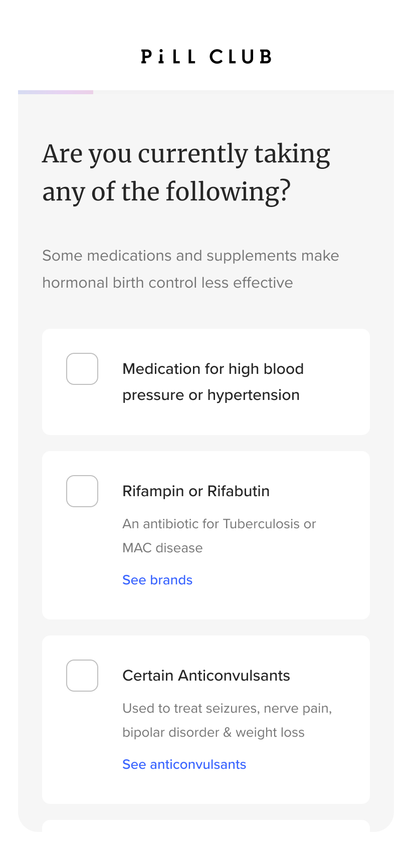
afterApplying the Redesigned Flow and Interface Enhancements
The final questionnaire design incorporated improvements based on user testing findings, identified pain points, and UX best practices. Below are highlights of key changes across the new experience.
Deliver the Solutionfinal designStart Page
Added a friendly illustration to introduce the questionnaire process and enhance branding
Clearly communicated that user information is secure and privacy is prioritized
Added arrows to the back and next buttons to clarify navigation actions
beforeAfter 

final designPage One
Simplified eligibility to a single clear question
Moved ineligible responses to the top of the selection list
Placed the “none” option at the bottom to encourage users to review medical information first

before
Afterfinal designPage Two
Questions
Moved the medication eligibility question earlier so users know right away if their medications might affect birth control options
Added a “no medications” choice to make it easier for users who don’t take any medications to move forward
Follow-up Question
If users reported taking other medications
Grouped medication-related questions together
Added explanations about potential interactions with birth control
Let users enter medications not listed for the medical team to review

beforeOriginally on page 3

after
Follow-Up questionfinal designQuestion Three
Simplified the wording for easier understanding
Merged ring and pill questions
Listed the most common medical conditions first
Placed the “none” option last to minimize scrolling

before
after final designPage Four
Grouped related medical condition questions together
Added guidance on where users could get a free blood pressure reading if needed
beforeAfter 

final designPage Five
Added a warning about nicotine risks with birth control, shown only if users select “Yes”
Introduced icons to help users make quicker, more confident decisions
beforeAfter 
final designPage Six
Moved the height and weight question to its own page to prevent users from skipping it
Removed example text so users wouldn’t confuse it for pre-filled information
Added logic to only ask about the morning-after pill if the user's BMI was under 26
beforeAfter 
final designPage Seven
Simplified the wording for easier understanding
Added icons as visual aids to help users make quick decisions and improve the user experience
Show the follow-up question based on user selection so users are not overwhelm with a lot of content
beforeAfter 
follow-up question

final designBirth Control Option Pages For Users Who are Eligible For The Pill And Ring
Displayed both options with icons to support quicker, more confident decision-making
beforeAfter 
final designBirth Control Option Pages For Users Who Are Only Eligible For The Pill
Displayed both options with icons to support quicker, more confident decision-making
Added educational content about birth control to help users make informed decisions
before Originally on page 2
After 
final designBirth Control Option Pages For Users Who Are Only Eligible For The Pill
Displayed both options with icons to support quicker, more confident decision-making
Added educational content about birth control to help users make informed decisions
beforeAfter 
final designBirth Control Option Pages For Users Who Are Only Eligible For The Pill
Added educational content about birth control to help users make informed decisions
Added a friendly illustration to make the experience more welcoming

beforeAfter 
final designLast Question
Gave users a space to share any additional information, questions, or concerns with the medical team

After final designIneligible Message
Added a friendly illustration to make the ineligible message feel more supportive and aligned with the brand experience
beforeAfter 

LearningsCross-Team Collaboration Was Key to Improving the Sign-Up Experience
This project showed me how important close collaboration is when improving a complex experience like a medical questionnaire. Here’s what I learned:
1.
Having dedicated support from the medical team helped us create a better, more personalized experience for patients.
2.
Partnering more closely with the technology and data teams would help us gather better insights and make smarter decisions over time.
3.
Building stronger relationships with legal and medical experts is essential for finding the right balance between compliance and user experience.